Novolex Website Redesign
Novolex stands as a pioneering force in the realm of packaging, renowned for its unwavering commitment to innovation, diverse product offerings, and sustainability. With expertise spanning paper, plastic, and sustainable materials, Novolex proudly serves the food, retail, health, and industrial sectors.
As a dynamic and rapidly expanding company, Novolex adeptly adapted to the ever-evolving market demands during the challenging times of the COVID-19 pandemic. The company embraced the need for change and swiftly adjusted its strategies, operations, and product offerings to meet the shifting requirements and emerging opportunities presented by the unprecedented global situation.
My Role
Visual Experience Designer
Project Duration
6 Weeks
Team Members
1 Project Manager
1 Creative Director
1 Sr. Designer
1 Content Strategist
1 Developer
Old Site
Old Site
Situation
The primary goal of this engagement was to develop an intuitive user interface (UI) that authentically embodied the core values of Novolex.
Key stakeholders within Novolex sought a website redesign that encompassed an attractive and contemporary visual language. The revised aesthetics aimed to not only resonate with existing clients but also captivate younger audiences, ensuring a broader appeal across different demographics.
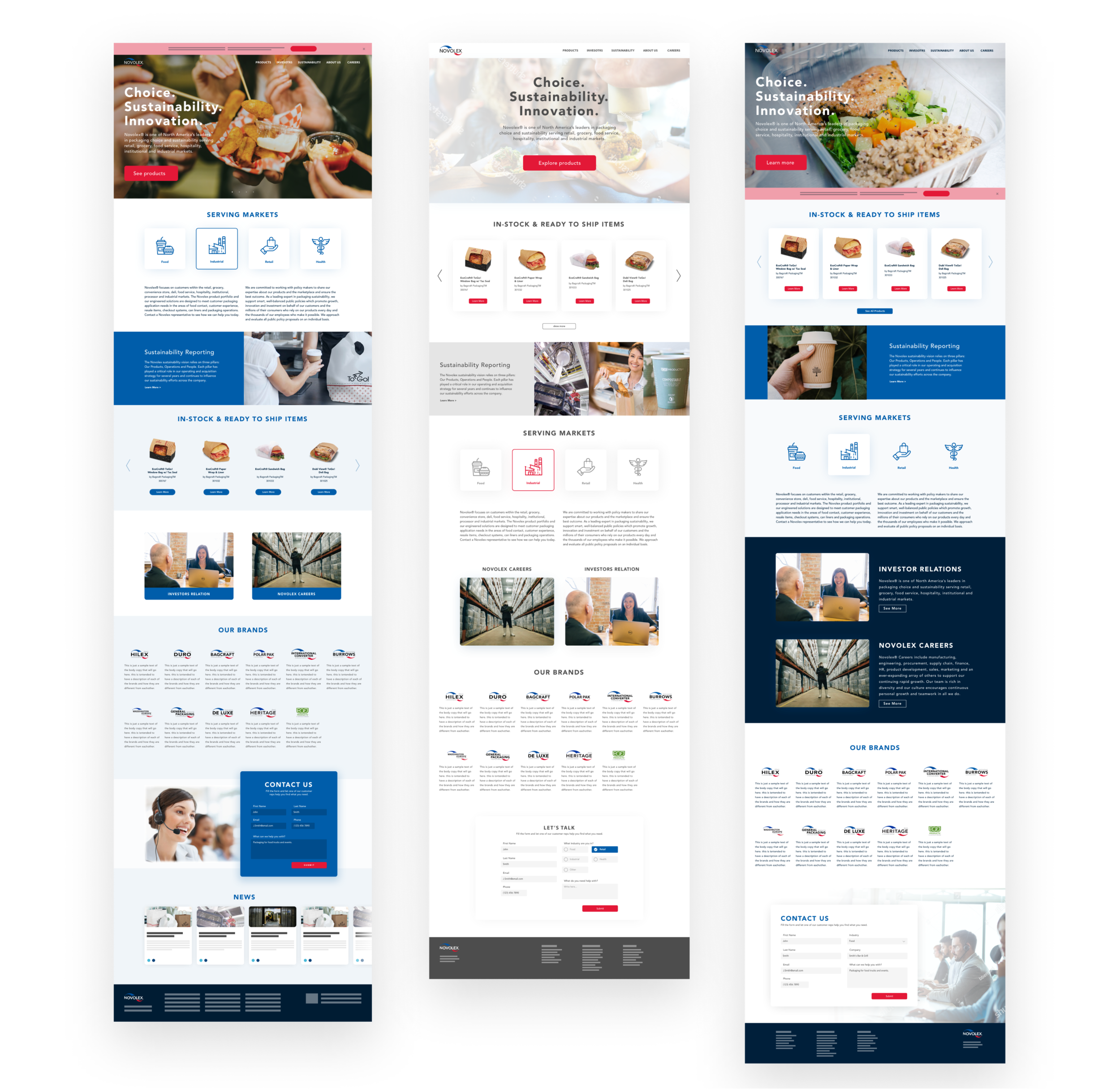
Wireframes for white version of website
Opportunities
Visual Language:
The existing site suffered from an outdated visual aesthetic, displaying numerous inconsistencies in graphics, photography, and a lack of typographic hierarchy. Moreover, the current brand colors, primarily red, white, and blue, were elementary and posed challenges as they could easily evoke political or American associations. A modern and cohesive visual look was required to unify the messaging effectively.
Information Architecture:
The absence of a clear structure posed difficulties for users in locating desired content. The sitemap presented an excellent opportunity to establish organization and improve the overall hierarchy, enhancing user navigation.
Time & Effort:
The team faced significant time constraints from the outset, as the website played a pivotal role in the business, especially during the COVID-19 pandemic when there was an exponential surge in demand for Personal Protective Equipment and Food Containers.
Mid Level Fidelity Prototype
13
Templates created for extra content use
32
Final full screens designed and developed
320+
PDFs on content audit that needed to be sorted out to then be categorized
Activities
These activities helped the team gain velocity and quickly pivot to produce and deliver the entire website redesign in less than 8 weeks. Activities included:
Stakeholders Interviews
Prioritization Activity
Moodboards
User Flows
Art/Creative Direction
Content Audit
Site Map
Wireframes (Low-Fi & High-Fi)
Results
Mobile solution was part of the delivery
Style Guide and High-End Development Produced
Responsive Layout was a consideration of the deliverables


